Showing posts with label health. Show all posts

Rethink: De-branding Cigarette Packs


A move intended to subvert the alluring brands of tobacco giants and make smoking less attractive, London-based consultancy Build created these satirical yet serious visualisations of how a packet of 20's might look if the branding were to be stripped away. The project is entitled "Rethink".

Interesting alternatives to the "Smoking Kills" warnings are included; giving smokers some serious insights into how much time each pack smoked will rob them of, and making a feature of the terrifyingly long list of ingredients that go into each pack.

[via]


Are You Obsessed About The Right Things?


An insanely creative advertising campaign for the Breast Cancer Foundation.

Advertising Agency: DDB, Singapore
Executive Creative Director: Joji Jacob
Creative Director: Thomas Yang
Copywriter: Khairul Mondzi
Art Director: Andrea Kuo
Account Director: Rowena Bhagchandani
Account Executive: Ng Ling Kai
Illustrator: Andy Yang Soo Kit
Digital retoucher: Agnes Teo
Photographer: Allan Ng / Republic Studios

[via]

The Allergy Collection


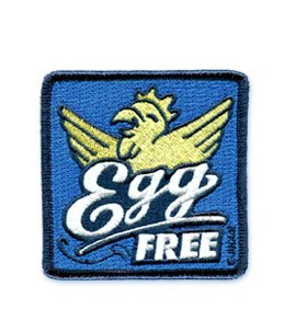
The cutest allergy graphics for your kids. You can find them as badges, stickers, or even tshirts here.

[via]

Our Skin Never Forgets


A campaign against skin cancer by the Swiss Cancer Foundation.
Mannequins on display at public swimming pools are covered with sticky reminders notes dramatically illustrating the threatening capacity of our skin.

[via]

Tom Gauld on Diet Coke


Comic artist Tom Gauld has produced some rather lovely work for a new series of cans for Diet Coke...

The limited edition cans are designed to raise awareness of The Heart Truth, the women's heart health program. Gauld also helped create a series of animations for the campaign, two of which can be viewed here.

[via]

Derek Bowers ‘Safe Sex’ Campaign

Charged with developing an interesting campaign for the U.K.’s National Health Service, graphic designer Derek Bowers developed a visually stimulating ad series themed around alcohol labeling. The concept being that sexually transmitted diseases are often the consequence of ill-informed decisions made while under the influence.

The resulting designs are both visually stimulating and informative, if not even a little humorous. Through using the inherent recognition individuals have for these infamous brands and combining it with educational content, Bowers' designs succeed in making this information a product worth consuming.

[via]

An Apple a Day Wall Calendar


Apple calendar from Germany reminds us that an apple a day keeps the doctor away.

Every day, after you remove one apple from the tube and eat it, the rest of the apples will move down and reveal today’s date. At the end of the month, the tube is refilled with 31, 30 or 28 apples.


[via]

Stereotype by Daizi Zheng


This project is designed by Chinese designer Daizi. It is a range of healthy snacks packaged to look like drugs and junk food, including these blueberries in a blister pack.

Called Stereotype, the project includes carrot sticks packaged like cigarettes and celery sticks in a french fry carton.


Here’s some more information from Daizi Zheng:

"Stereotype is about helping people eat more healthier through their everyday habits.
According to the World Health Organization (WHO), unhealthy diet is amongst one of the leading causes of the major non-communicable diseases.

The series of food packaging were created from the observations on personal behaviors.
Using the recognizable stereotyping packaging would make people feel more physically and physiologically connected with those daily objects.

By giving the good food a little make over, it could contribute the availability of healthy food and encourages people to make a change for their everyday life."

[via]

Color Codes for The Color Blind


Can you imagine a world without color? From health care to transportation, we rely on it to cue us daily.

Miguel Neiva has created a color coding system to improve daily life for the predominantly male population who experience color blindness. The Color Add Color Identification System offers monochromatic icons to represent a range of colors. Using red, yellow and blue as the foundation, a code is developed in order to create visual icons. These icons can then be included on all color-based systems (from clothing tags to transportation maps) in order to increase accessibility and understanding.

[via]

NYC Condom Package


Two years ago, the City of New York's Department of Health and Mental Hygiene,
unveiled the city's first official condom on valentine's day. the original design features the letters 'NYC CONDOM' in the iconic style of the city's subway-line logos.

To keep things interesting, the city is giving new york city dwellers the chance to promote safer sex throughout the city. They're asking New Yorkers to design a special edition wrapper for NYC's iconic prophylactic. The contest is open to any New York City resident 17 and older. The winning design will grace condom packages in fall of 2010 and could also appear in social marketing campaigns.

[via]

Swine Flu Hanky

If you've got swine flu, you’ll need somewhere to blow your nose! It even has an H1N1 embroidered monogram! Buy it here.

[via]
Related Posts Plugin for WordPress, Blogger...