Showing posts with label warning. Show all posts

Rethink: De-branding Cigarette Packs


A move intended to subvert the alluring brands of tobacco giants and make smoking less attractive, London-based consultancy Build created these satirical yet serious visualisations of how a packet of 20's might look if the branding were to be stripped away. The project is entitled "Rethink".

Interesting alternatives to the "Smoking Kills" warnings are included; giving smokers some serious insights into how much time each pack smoked will rob them of, and making a feature of the terrifyingly long list of ingredients that go into each pack.

[via]


3D Illusion To Slow Down Traffic


Preventable, BCAA Traffic Safety Foundation, and the District of West Vancouver have launched a 3D illusion geared to make drivers slow down at high-risk intersections.

An optical illusion of a little girl chasing a ball has been installed.
The 3D illusion rises up gradually from about 100 feet away and fades away by the time a driver approaches.

Warning signs leading up to the illusion were installed to prepare drivers.
The goal is to draw attention to the risk of children running onto the road.

More info here.

[via]

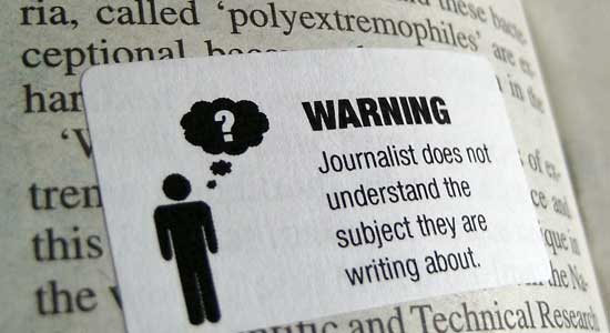
Journalism Warning Labels


From the designer, Tom Scott:

"It seems a bit strange to me that the media carefully warn about and label any content that involves sex, violence or strong language — but there's no similar labelling system for, say, sloppy journalism and other questionable content.

I figured it was time to fix that, so I made some stickers. I've been putting them on copies of the free papers that I find on the London Underground. You might want to as well."

You can download the template and read more about it here.

[via]

The Allergy Collection


The cutest allergy graphics for your kids. You can find them as badges, stickers, or even tshirts here.

[via]

Doritos Seriously: The New Line of Doritos


"A concept to cover the full range of Doritos products and promotion. Based on the distinctive triangular corn chips in the form of warning signs, the design highlights the bold and intense flavours of Doritos."

via The Dieline
Related Posts Plugin for WordPress, Blogger...